If you’re searching for a clear, practical way to turn raw data into meaningful insights, this guide is built for you. Whether you’re a beginner trying to understand charts or a developer looking to sharpen your visual storytelling skills, this article delivers a step-by-step python data visualization tutorial designed around real-world use cases.
Data is only powerful when it’s understood. Many professionals struggle with choosing the right visualization techniques, structuring datasets correctly, or using the most effective Python libraries for impactful results. Here, you’ll learn how to transform complex datasets into clear, compelling visuals using proven tools and modern best practices.
To ensure accuracy and relevance, this guide draws on established data science methodologies, widely adopted visualization frameworks, and practical workflows used by industry practitioners. By the end, you’ll not only know how to create charts—but how to design visualizations that communicate insights with clarity, precision, and confidence.
From Raw Data to Powerful Insights with Python
Raw data is just numbers until you ask better questions. In this python data visualization tutorial, you’ll move from messy spreadsheets to clear, decision-ready visuals using the right tools for the job.
Start with Pandas for cleaning (handling missing values, filtering rows). Use Matplotlib for quick exploratory charts and Seaborn when you need statistical visuals like heatmaps or regression plots. For interactive dashboards, turn to Plotly.
Not sure which to pick? If you’re exploring, keep it simple. If you’re presenting, prioritize clarity and interactivity. Pro tip: always visualize distributions before modeling—they often reveal hidden outliers.
The Ecosystem Advantage
Python excels in data visualization because of its tightly integrated ecosystem. Libraries like Matplotlib, Seaborn, and Plotly connect seamlessly with Pandas (for structured data manipulation) and NumPy (for numerical computing). That means you can clean, transform, and visualize data in one continuous workflow—no exporting, no copy-pasting between tools (goodbye, spreadsheet chaos).
| Tool | Primary Function | Key Benefit |
|---|---|---|
| Pandas | Data manipulation |
Clean datasets quickly |
| NumPy | Numerical computing | Fast array operations |
| Matplotlib/Seaborn | Visualization | Deep customization |
Flexibility and Control
GUI tools like Excel or Tableau are convenient, but they limit automation and reproducibility. Python scripts can be version-controlled, shared, and rerun with new data instantly—critical for analytics pipelines and machine learning workflows.
Community and Career Impact
With thousands of open-source packages and tutorials—including any solid python data visualization tutorial—you’ll rarely get stuck. Because Python dominates data science (Stack Overflow Developer Survey), visualization skills directly strengthen your analytics and ML career trajectory.
The Foundation: Creating Essential Plots with Matplotlib
What Is Matplotlib?
Matplotlib is the foundational plotting library in Python. In simple terms, a library is a collection of prewritten code that helps you perform tasks faster. Matplotlib is powerful and highly customizable—though, yes, sometimes a bit verbose (you’ll write more lines than you expect).
Some developers argue it’s outdated compared to sleeker tools like Seaborn or Plotly. That’s fair—those libraries can feel more modern. However, they’re often built on top of Matplotlib. If you want fine-grained control, Matplotlib is still the bedrock.
Core Concepts: Figure and Axes
Beginners often struggle with figure and axes.
- Figure: Think of it as the canvas.
- Axes: The actual plot area where data appears.
In other words, the figure holds everything; the axes display your data. Once this clicks, everything else becomes easier.
Practical Example 1: Line Plot
A line plot shows trends over time.
import matplotlib.pyplot as plt

years = [2020, 2021, 2022, 2023]
sales = [150, 200, 250, 300]

fig, ax = plt.subplots()
ax.plot(years, sales)
ax.set_title("Sales Over Time")
ax.set_xlabel("Year")
ax.set_ylabel("Sales")

plt.show()
Practical Example 2: Bar Chart
A bar chart compares categories.
products = ['A', 'B', 'C']
revenue = [30, 45, 25]

fig, ax = plt.subplots()
ax.bar(products, revenue, color=['blue', 'green', 'red'])
ax.set_title("Revenue by Product")
ax.set_ylabel("Revenue")

plt.show()
When to Use Matplotlib
While some prefer higher-level tools for speed, Matplotlib excels when you need deep customization or want to embed visuals into applications. Pro tip: mastering it makes every other python data visualization tutorial easier to understand.
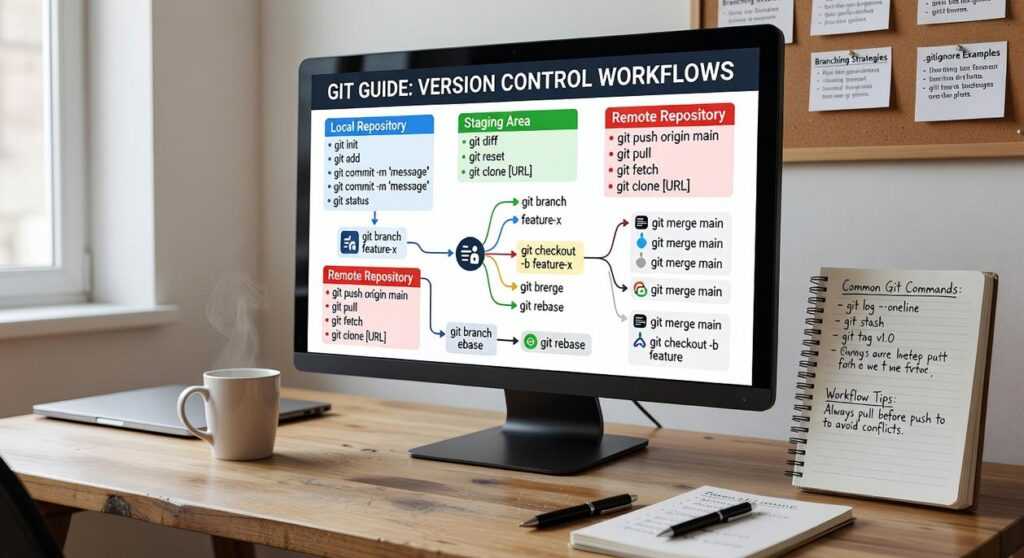
For workflow efficiency, version your plotting scripts properly—see a complete guide to version control with git.
Statistical Beauty: Crafting Advanced Visuals with Seaborn

What Is Seaborn?
Seaborn is a high-level interface built on top of Matplotlib, the foundational plotting library in Python. A high-level interface simply means it abstracts away complex configuration, letting you create polished statistical graphics with minimal code. While Matplotlib gives you granular control, Seaborn gives you elegance by default (because not everyone wants to micromanage tick marks at midnight).
The Seaborn Advantage
First and foremost, Seaborn integrates tightly with Pandas DataFrames, Python’s tabular data structure. That means you can pass column names directly into plotting functions—no manual array slicing required. In contrast, many tutorials stop at aesthetics. What they often miss is how Seaborn accelerates exploratory data analysis by embedding statistical logic—like confidence intervals and kernel density estimation (KDE)—directly into plots. Fewer lines, richer insight.
Pro tip: set a global theme with sns.set_theme() before plotting to ensure visual consistency across reports.
Practical Code Example 1: Correlation Heatmap
Understanding variable relationships is easier with a correlation matrix (a table showing how strongly variables move together). With Seaborn, it’s almost effortless:
sns.heatmap(df.corr(), annot=True, cmap="coolwarm")
That single line generates a fully styled heatmap with annotated correlation coefficients.
Practical Code Example 2: Distribution Plot
To examine how a variable spreads, use a histogram with KDE:
sns.histplot(df["age"], kde=True)
This reveals skewness, clusters, and outliers instantly.
When to Use Seaborn
While some argue Matplotlib alone offers more flexibility, Seaborn shines in statistical exploration—especially when producing insights quickly for dashboards, reports, or a python data visualization tutorial. Ultimately, if clarity and speed matter, Seaborn delivers both.
Go Interactive: Engaging Your Audience with Plotly
What Is Plotly?
Plotly is a go-to Python library for building interactive, web-ready visualizations. Unlike static charts in Matplotlib, Plotly charts respond to clicks, hovers, and zoom commands right in the browser. Think PowerPoint slide vs. live demo—one shows, the other lets you explore.
Why Interactivity Matters
Features like hover-tooltips (data that appears when you rest your cursor on a point), zooming, and panning turn viewers into participants. Some argue static charts are “cleaner.” True—but interactive visuals uncover deeper context without clutter. It’s the difference between reading a map and driving the route yourself (yes, like switching from a paper atlas to Google Maps).
Practical Code Example
import plotly.express as px

df = px.data.iris()
fig = px.scatter(df, x="sepal_width", y="sepal_length",
                 color="species", hover_data=["petal_length"])
fig.show()
When to Use Plotly
Perfect for Dash dashboards, presentations, or any python data visualization tutorial where engagement matters. Use it when exploration beats explanation.
Turning abstract data into clear, actionable insights is harder than it sounds. We all face spreadsheets that feel like static. So, how do you choose the right tool?
Personally, I see Matplotlib as the craftsman’s hammer—total control, pixel deliberate. Meanwhile, Seaborn adds statistical beauty with minimal effort; it’s the “set it and admire it” option. On the other hand, Plotly wins when interactivity matters, especially for dashboards stakeholders can explore.
If you’re following a python data visualization tutorial, pick one library today. Import a CSV, recreate a simple chart, and iterate. After all, data story starts with a single plot.
Mastering Data Visualization with Python
You started this guide to finally make sense of your data and turn raw numbers into clear, compelling visuals. Now you understand the core tools, essential libraries, and practical techniques that transform complex datasets into insights you can actually use.
If you’ve been struggling with confusing charts, unclear dashboards, or data that fails to tell a story, you’re not alone. Poor visualization leads to missed insights and weak decisions. The good news? With the right structure and approach, you can present data with clarity and confidence.
The next step is simple: put what you’ve learned into action. Revisit this python data visualization tutorial, apply the examples to your own datasets, and start building visualizations that communicate impact—not confusion.
If you’re ready to go further, access our expert tutorials, machine learning frameworks, and advanced visualization strategies designed to help you move from beginner charts to professional-level insights. Join thousands of learners improving their technical edge—start building smarter visuals today.
 Head of Machine Learning & Systems Architecture
Justin Huntecovil is the kind of writer who genuinely cannot publish something without checking it twice. Maybe three times. They came to digital device trends and strategies through years of hands-on work rather than theory, which means the things they writes about — Digital Device Trends and Strategies, Practical Tech Application Hacks, Innovation Alerts, among other areas — are things they has actually tested, questioned, and revised opinions on more than once.
That shows in the work. Justin's pieces tend to go a level deeper than most. Not in a way that becomes unreadable, but in a way that makes you realize you'd been missing something important. They has a habit of finding the detail that everybody else glosses over and making it the center of the story — which sounds simple, but takes a rare combination of curiosity and patience to pull off consistently. The writing never feels rushed. It feels like someone who sat with the subject long enough to actually understand it.
Outside of specific topics, what Justin cares about most is whether the reader walks away with something useful. Not impressed. Not entertained. Useful. That's a harder bar to clear than it sounds, and they clears it more often than not — which is why readers tend to remember Justin's articles long after they've forgotten the headline.
Head of Machine Learning & Systems Architecture
Justin Huntecovil is the kind of writer who genuinely cannot publish something without checking it twice. Maybe three times. They came to digital device trends and strategies through years of hands-on work rather than theory, which means the things they writes about — Digital Device Trends and Strategies, Practical Tech Application Hacks, Innovation Alerts, among other areas — are things they has actually tested, questioned, and revised opinions on more than once.
That shows in the work. Justin's pieces tend to go a level deeper than most. Not in a way that becomes unreadable, but in a way that makes you realize you'd been missing something important. They has a habit of finding the detail that everybody else glosses over and making it the center of the story — which sounds simple, but takes a rare combination of curiosity and patience to pull off consistently. The writing never feels rushed. It feels like someone who sat with the subject long enough to actually understand it.
Outside of specific topics, what Justin cares about most is whether the reader walks away with something useful. Not impressed. Not entertained. Useful. That's a harder bar to clear than it sounds, and they clears it more often than not — which is why readers tend to remember Justin's articles long after they've forgotten the headline.